Most monitoring tools are built to answer one question: “Is something broken right now?”
That sounds useful—until you realize it doesn’t help you understand how you got there.
By the time an alert fires, the issue has already crossed a threshold. CPU is already maxed. Disk is already full. Queries are already slow. You’re reacting, not preventing.
That’s where infrastructure health dashboards change the game. They don’t just show you what’s happening—they show you how things are evolving over time.
Why Traditional Monitoring Falls Short
Here’s the thing: alerts are inherently reactive.
They’re triggered by thresholds. And thresholds are blunt tools. They don’t capture gradual degradation, subtle patterns, or slow-moving risks.
For example:
- CPU creeping from 40% to 70% over weeks
- Disk usage growing steadily day by day
- Database queries getting slightly slower over time
None of these trigger alerts immediately. But they’re exactly the signals that matter.
By the time an alert fires, you’re already dealing with impact.
What Infrastructure Health Dashboards Actually Show
A health dashboard shifts the focus from real-time alerts to long-term visibility.
Instead of asking “Is it broken?”, you start asking:
- Is performance trending in the wrong direction?
- Are resources being consumed faster than expected?
- Is this system behaving differently than last week?
These dashboards typically include:
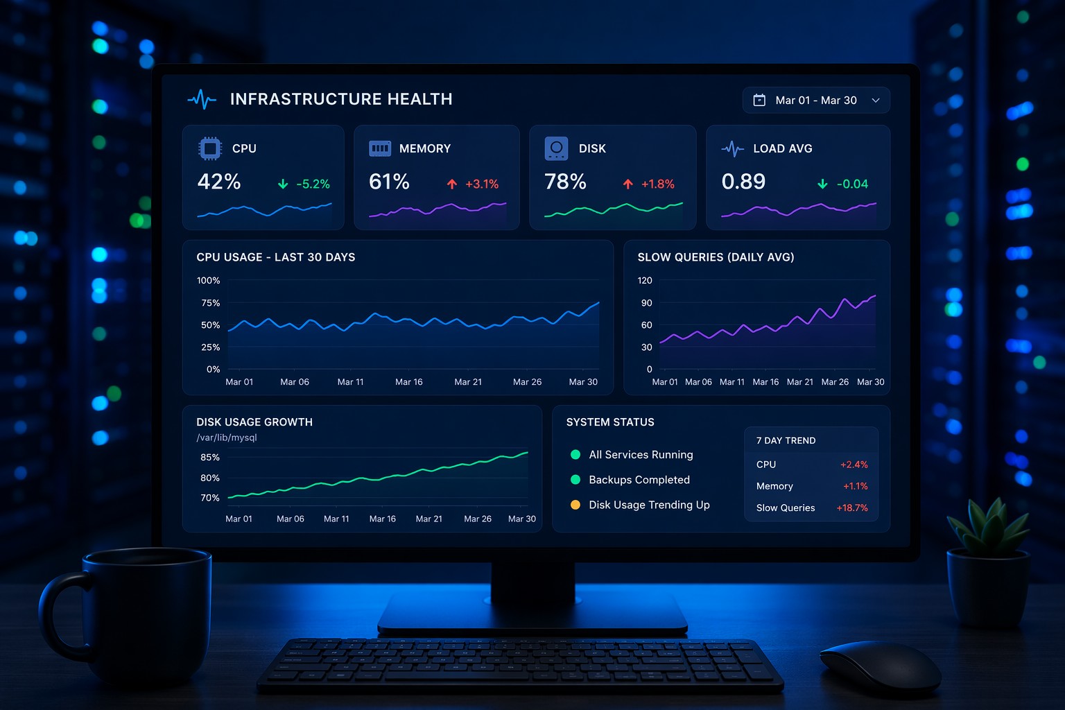
- CPU, memory, and disk trends over time
- Database performance metrics (query time, connections, slow queries)
- System load patterns across days or weeks
- Growth indicators (data size, logs, cache usage)
But more importantly, they present this data in a way that highlights change—not just current state.
Why This Matters in Real Environments
Let’s take a simple example.
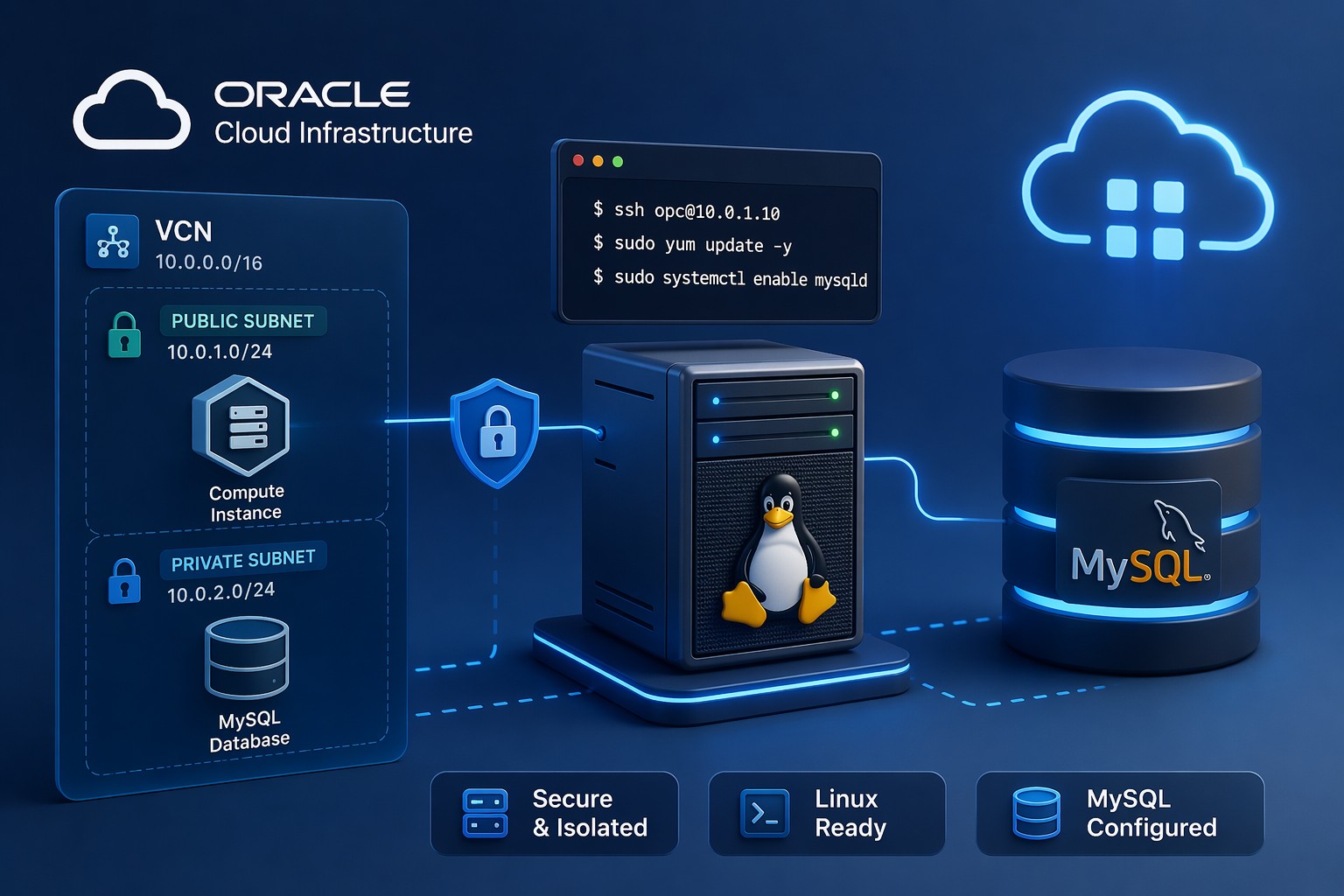
You’re running a MySQL server. Everything looks fine today. No alerts. No complaints.
But over the past 30 days:
- Average query time increased by 25%
- Slow queries doubled
- CPU usage during peak hours climbed steadily
No single metric crossed a threshold. But together, they tell a clear story: something is degrading.
Without a health dashboard, you’d miss this completely.
And eventually, it becomes an incident.
From Alerts to Trends: A Better Mental Model
Most teams are stuck in an alert-first mindset.
But this is where it matters: alerts should be the last line of defense—not the first.
1. Observe Trends First
Use dashboards to understand how systems behave over time. Look for gradual changes, not just spikes.
2. Identify Early Signals
Spot patterns like steady growth, increasing latency, or resource creep.
3. Act Before Thresholds
Fix issues while they’re still small—before users notice anything.
4. Keep Alerts as Backup
Alerts still matter. But now they’re safety nets, not primary tools.
What to Include in a Practical Health Dashboard
If you’re building or evaluating one, focus on clarity over complexity.
You don’t need dozens of panels. You need the right signals.
Start with:
- CPU Trends: Average and peak usage over time
- Memory Usage: Especially swap behavior and pressure
- Disk Growth: Not just usage, but rate of change
- Load Average: Patterns across different time windows
- Database Metrics: Slow queries, connections, query latency
Then layer in context:
- Daily patterns vs anomalies
- Week-over-week comparisons
- Correlation between metrics
This is where dashboards become powerful—they help you connect the dots.
A Simple Real-World Scenario
Imagine a small team managing a few Linux servers.
No dedicated SRE. No complex observability stack.
Just a handful of dashboards tracking system health.
Over time, they notice:
- Disk usage growing faster each week
- Backup jobs taking slightly longer
- CPU spikes becoming more frequent at night
Individually, these don’t look urgent.
But together, they point to a storage bottleneck forming.
So they investigate early. Clean up old data. Optimize backups.
No outage. No emergency.
Just quiet, proactive maintenance.
That’s the difference.
Keeping It Lightweight (Without Overengineering)
One of the biggest mistakes teams make is overcomplicating monitoring.
They adopt heavy tools, collect everything, and still struggle to see what matters.
But for most small to mid-sized environments, you don’t need that.
You need:
- Clear trend visibility
- Simple, focused dashboards
- A consistent way to review system health
Think of it like a weekly checkup, not a constant stream of noise.
That shift alone reduces alert fatigue and improves decision-making.
Summary
Infrastructure health dashboards help you move from reactive firefighting to proactive management.
Instead of waiting for alerts, you start seeing patterns—slow leaks, gradual growth, subtle degradation.
And that’s what keeps systems stable over time.
If you’re tired of chasing alerts and want a clearer view of how your infrastructure is actually behaving, it might be time to rethink how you monitor health. A simple, trend-focused approach can give you the visibility most tools miss—without adding more complexity.